


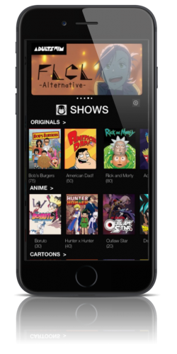
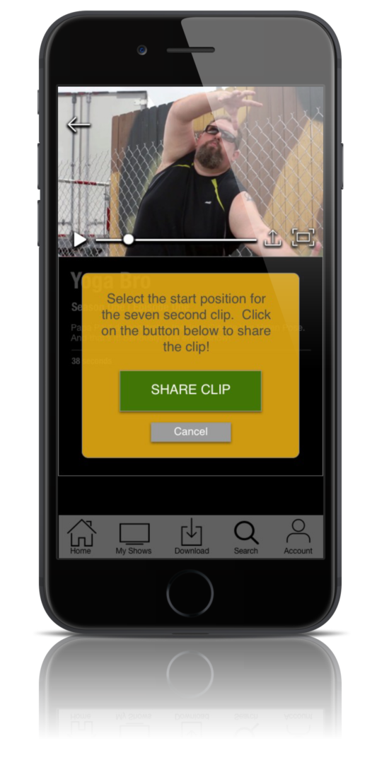
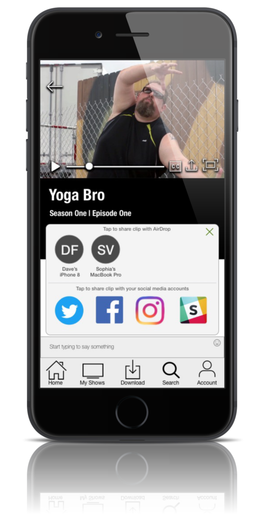
The goal of this concept was to re-engineer the Adult Swim streaming app into a premium streaming service mobile application. We wanted to attract new users by making content add free, easy to locate and enabled clip sharing via social media.
Our Research indicated that users not only expected ad free streaming and sharing capabilities but also the ability to brows new content, download and a chat about it.
The Redesign and Added Features:
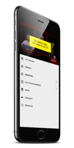
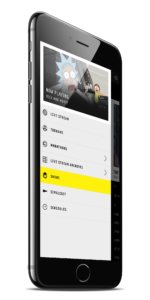
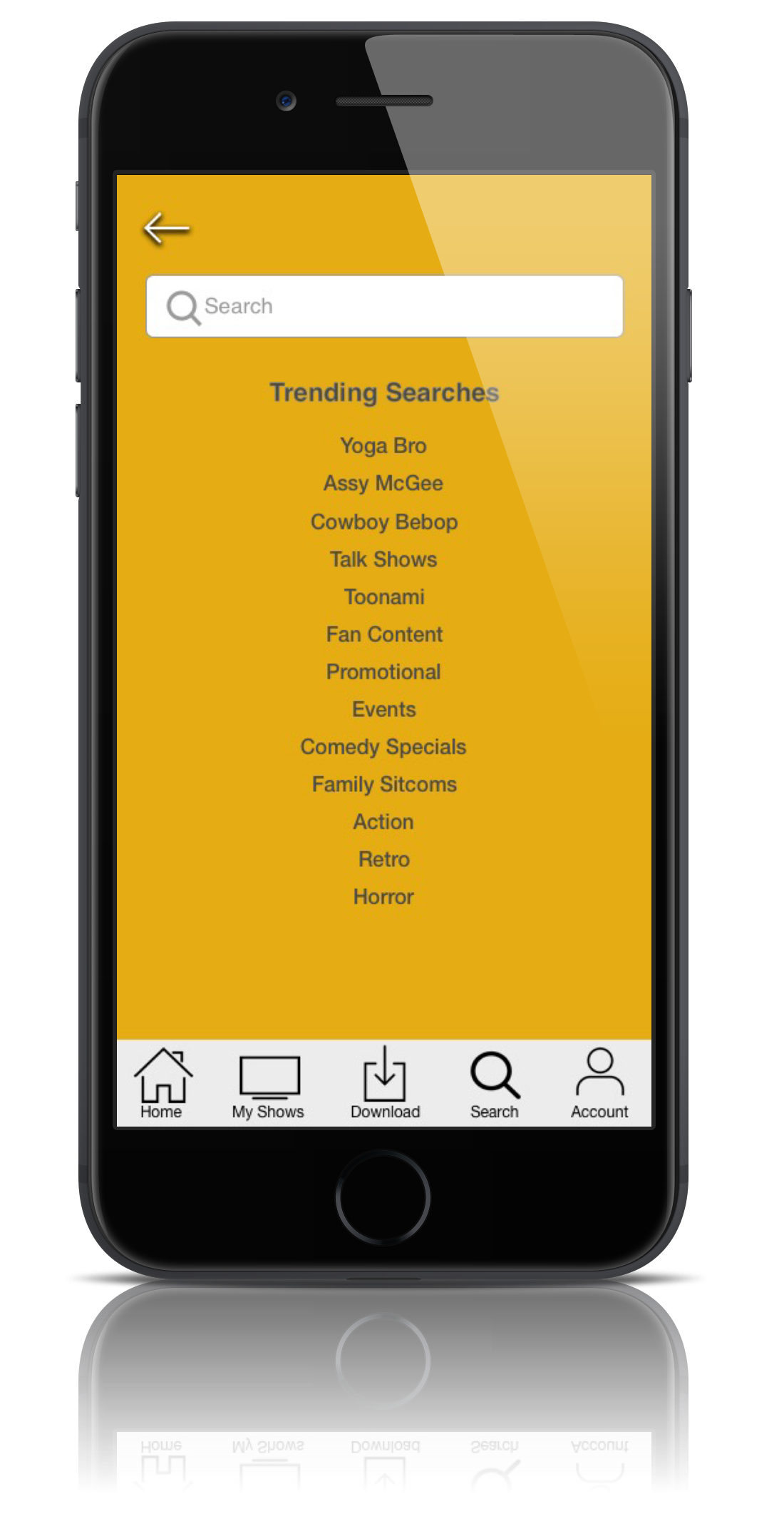
- Re-engineered the navigation and categories to enable more intuitive browsing capabilities
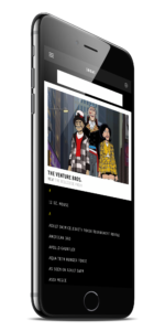
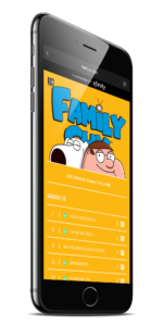
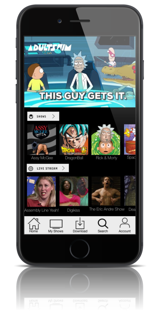
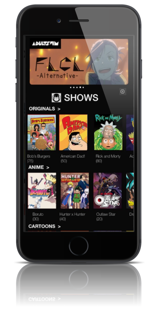
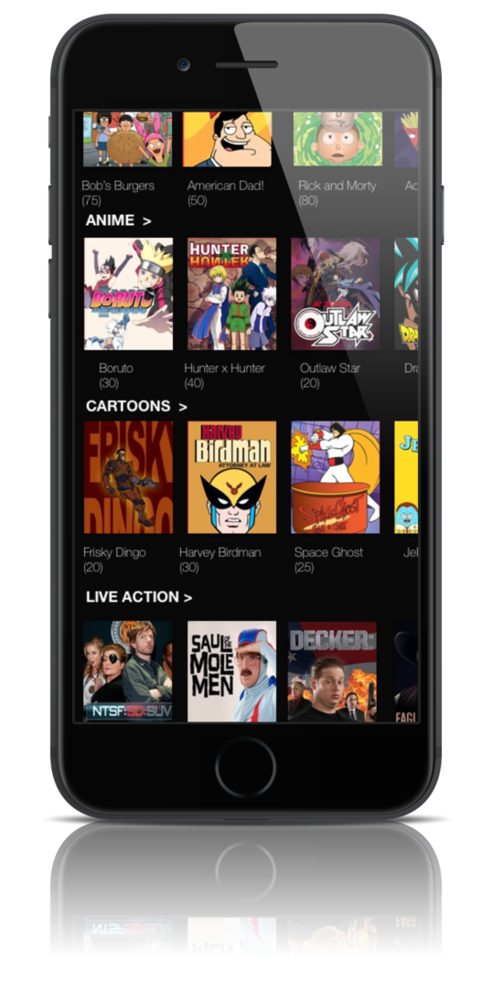
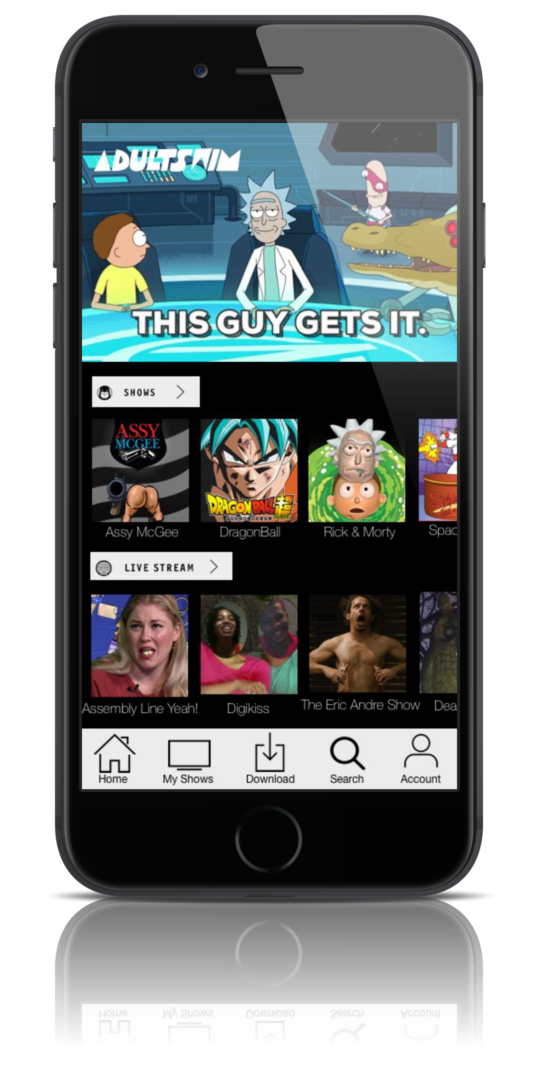
- Re -designed the landing screen and show list screen with visual story tiles to visually communicate the content
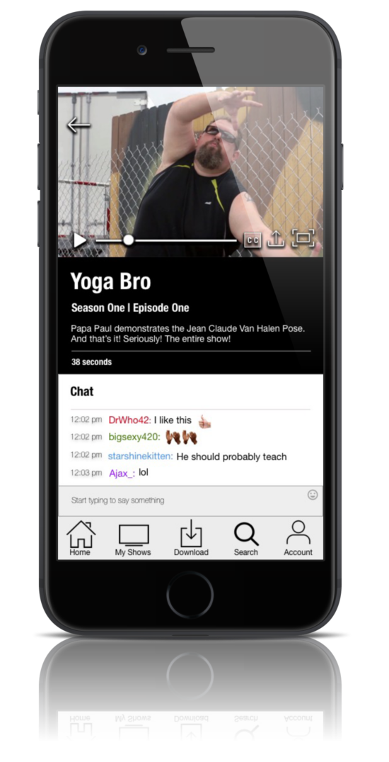
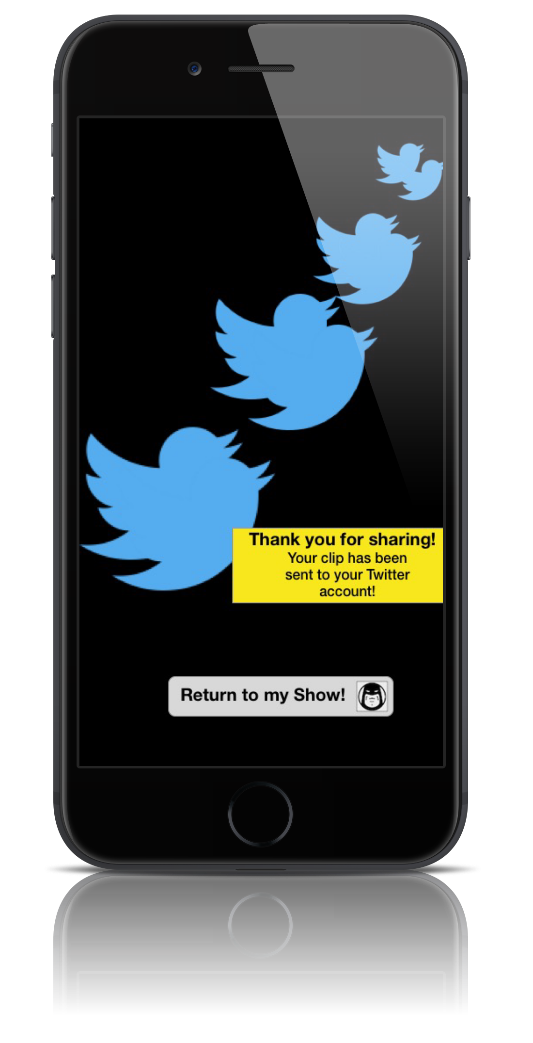
- Added a clip share, download and a chat feature
Perspective Client: Adult Swim (Tuner Broadcasting)
My Role: I worked alongside three team members to discover, researcher, design, test and deliver a prototype concept. I contributed directly to the user research, sketching, prototyping, wireframing, visual design and UI of the project.
Tools: Sketch & In-Vision
Timeline: 2 Weeks
Problem Statement
New Adult Swim viewers need a way to discover new shows and share clips because they are not familiar with the content and the current application does not have any sharing capability.
Proposed Solution Statement
We believe that by improving the browsing and user interface (one that is on par with other premium streaming services) we will help new and existing users discover new shows and share content with others.
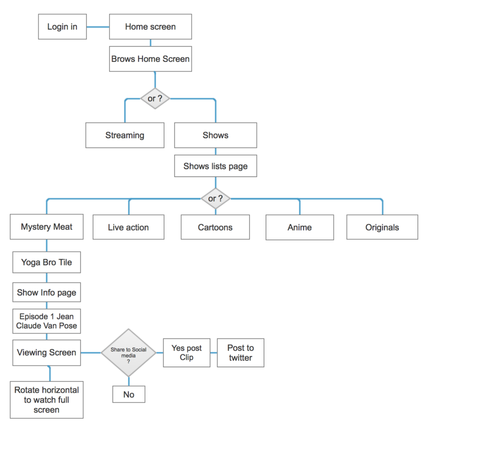
Existing Adult Swim App – user flow
The Process

Research

Development

Analysis
Testing

Design
Delivery
Research
What is Adult Swim?
One of the biggest obstacle was that we didn’t know what Adult Swim was. Through some careful online research, we found out.
Adult Swim is an adult-oriented nighttime programming block on Cartoon Network known for their experimental, risqué, unorthodox, crude, dry, and improvisational humor, along with purposefully cheap-looking animation, and often bizarre presentation.
We still had questions about the user base and streaming services in general and hoped to gain insight by comparing services and conducting user research.
- Who are the users?
- What features are expected from a premium service?
- What is the core problem?
Comparative Analysis
The research process was critical for this concept due to our limited knowledge of Adult Swim, the app and its content. It was also important to understand what a user expects from a premium streaming service application.
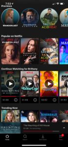
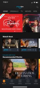
I referenced Netflix, amazon video and Cartoon Network to analyses comparable services. I looked at user reviews and ran a heuristic analysis of the different user flows. I also looked at Adult Swim’s webpage, its history and other services providing the same content.
- Competing services had visual browsing, download for offline use, sharing capabilities, a way to save shows and flag favorite and were add free
Netflix Amazon Video Adult Swim
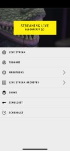
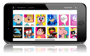
Cartoon Network
User Interviews & Contextual Inquiry
We needed to determine current pain points on the existing app as well as understand the expectations users would have in a premium service with Adult Swims content. In order to accomplish this, we had to talk with real users.
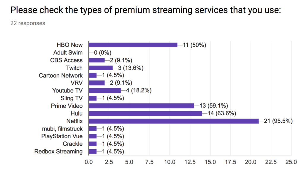
I contributed survey and interview questions and sent out twenty-two surveys. We ended up with seven people who qualified for an interview of which I conducted three. In conjunction with interviews we conducted a contextual inquiry to see how users interacted with the current app.
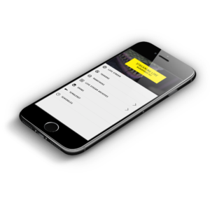
- Users were not happy with the adds. The current app was hard to navigate with no search function and browsing was specific to a user already familiar with the content. The shows are very unique and appeal to a particular audience.
“I cut cable because I don’t want to watch commercials”
“I like seeing what other people think of a show in the comments”
“How do I even search? There’s no search bar!”
Analysis
Affinity Mapping
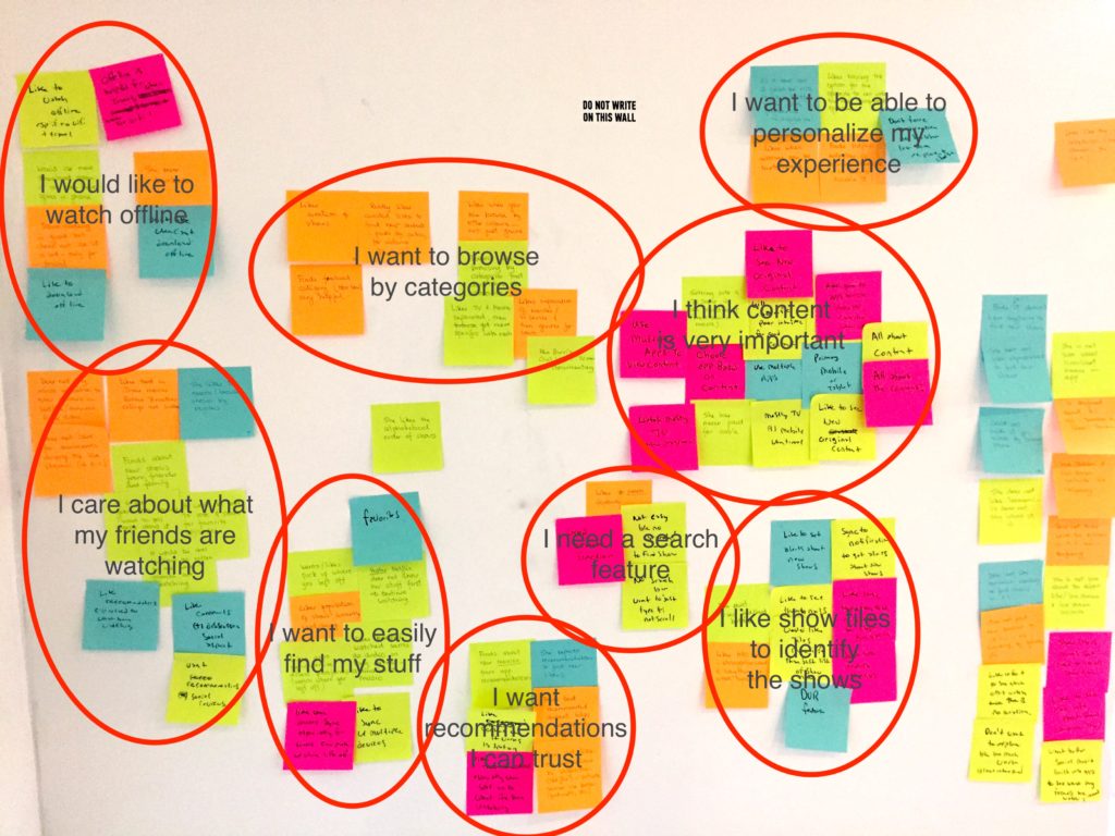
After completing interviews and testing we got back together for an affinity mapping session. The session help, us to organize and understand the information we had collected about who our target users are and why.
-
- I would like to watch offline
- I want to browse by categories
- I care about what my friends are watching
- I want to easily find my stuff
- I want recommendations that I can trust
- I think content is the most important aspect
- I want to be able to customize my experience
- I need a search function
- I like the tiles to identify the shows
Card Sorting
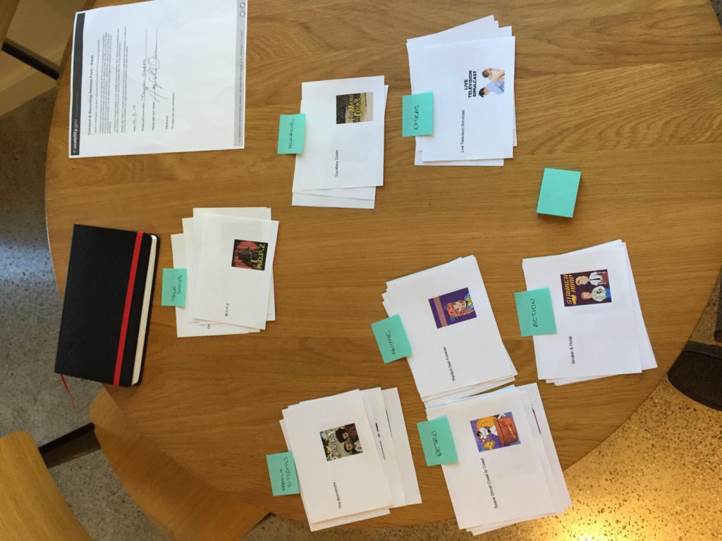
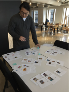
We need to figure out how to categorize the content in order to make it easier for users to navigate. The current app organized shows alphabetically as a list which was confusing to new and existing users trying to find new content. There was also no search function so a user had to recall the show names.
Categories:
Originals | Cartoons | Anime | Live Action | Mystery Meat
Personas
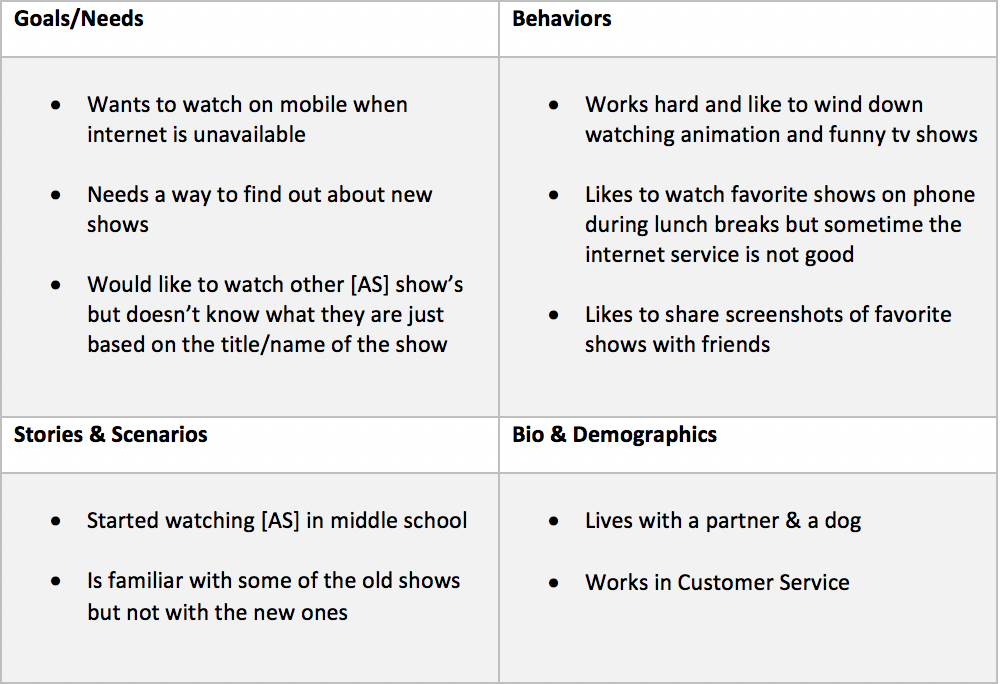
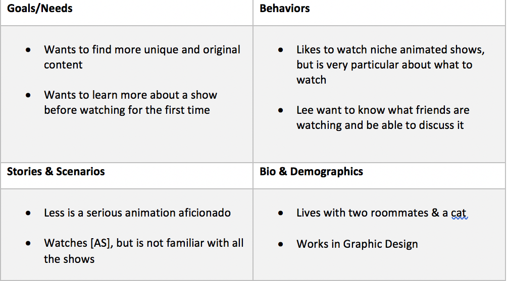
From our research we were able to develop two distinct personas that of the current user and that of the new user. We needed to consider both in the design so as not to only appeal to a new user but those that already used the current app and were looking for more.
Existing User: Alex
New User: Lee
Design
Sketching
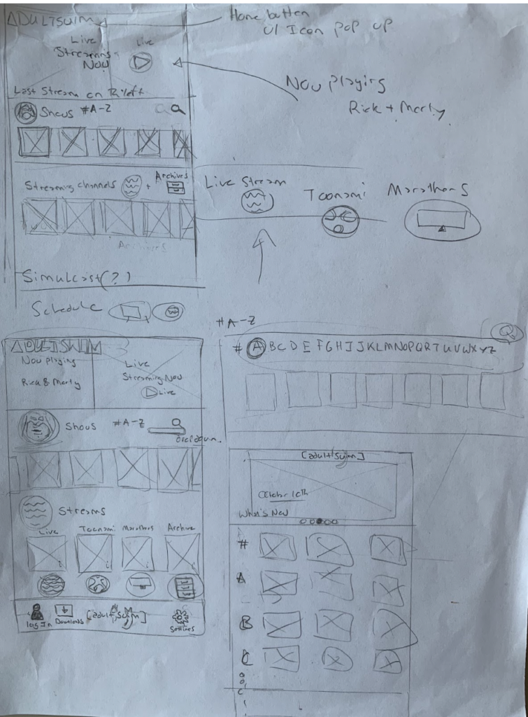
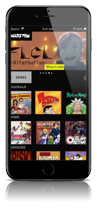
We referenced the original app, other streaming services, the site map, user flows and card sort data. Each of us focused on some sort of visual titling system for browsing shows and navigation button system. We also considered ways to add in a sharing, downloading and chat feature. I sketched out the home screen and shows screen and then we came together to combined ideas.
Navigation
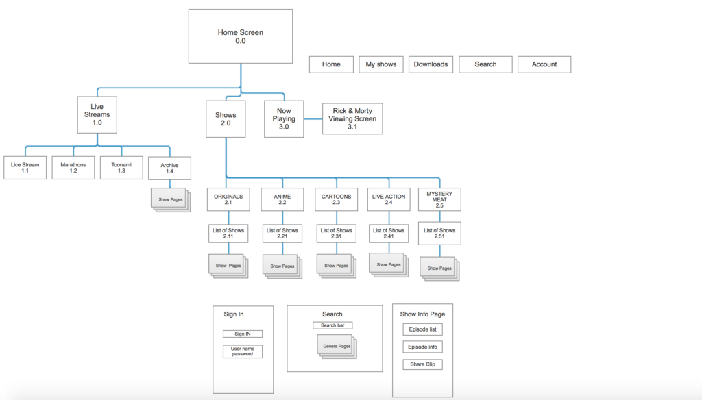
Re-designing the navigation was a critical component as the current system only lent to a user extremely familiar with the content. Before sketching we knew we needed to fix the navigation and research indicated that we should do some sort of visual tile browsing system.
The user flow and app map display the integration of the new navigation, visual tiles, and categories however the progression of the screens from home to viewing screen is a similar flow to that of the original application.
Home & Shows screen
Testing
User Testing & Iterations
To determine the usability of our design we needed to put our prototype in front of real users to see what worked and what didn’t. We divided up the testing and then came back together to discuss the results and prioritize iterations. I monitored a total of three tests for each round.
Iterations-
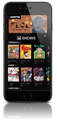
Shows list screen
- Shows to look less like a button
- Longer image tiles
- Labeled the shows
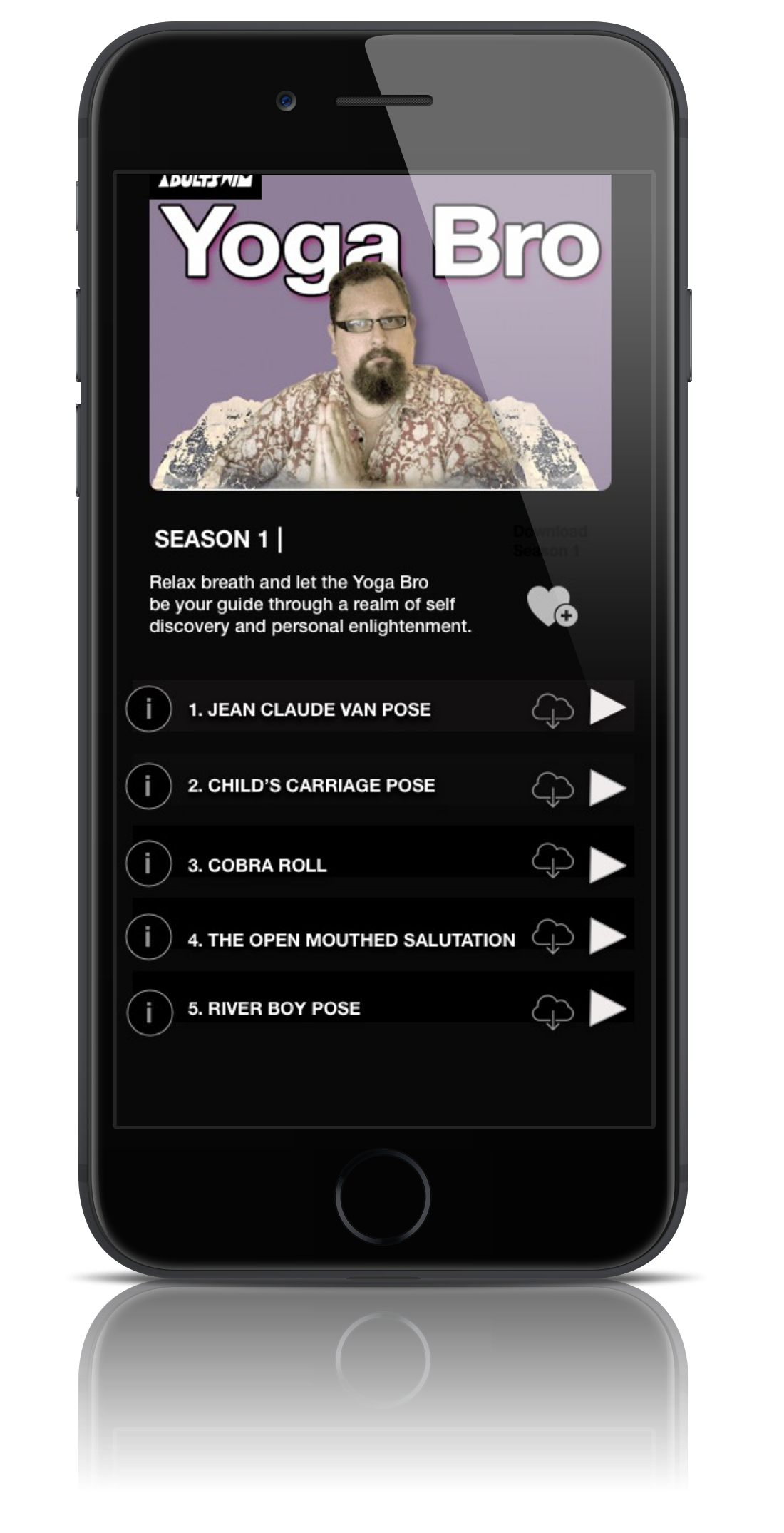
Show information screen
- Different play button
- Different information button
- Added Download & favorites
- Changed color of row
- Added show description and
Shows List Screen
v 0.0 v 1.0
Show Info Screen
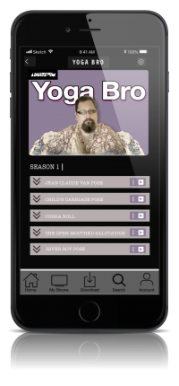
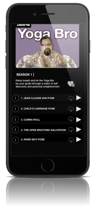
v 0.0 v 1.0
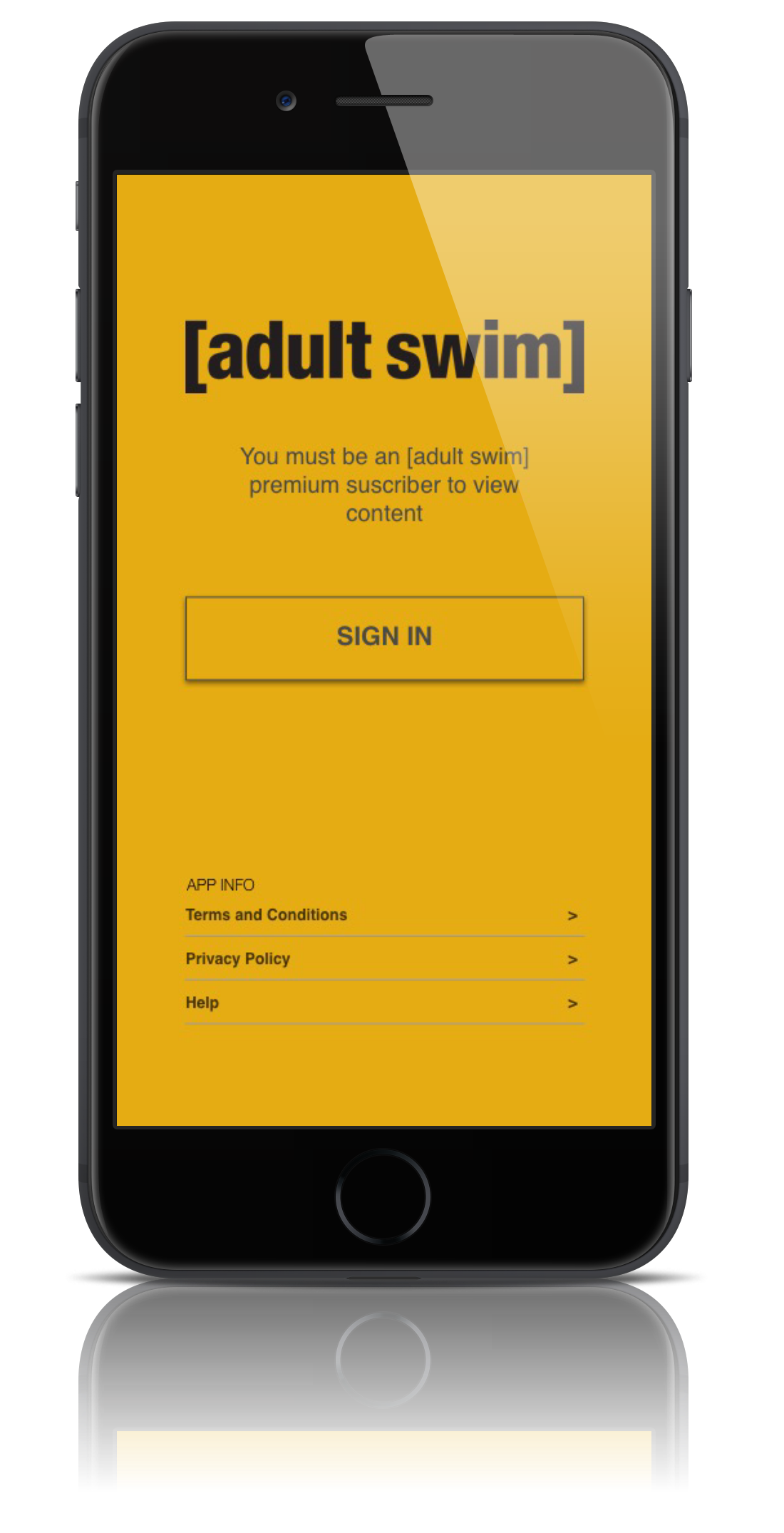
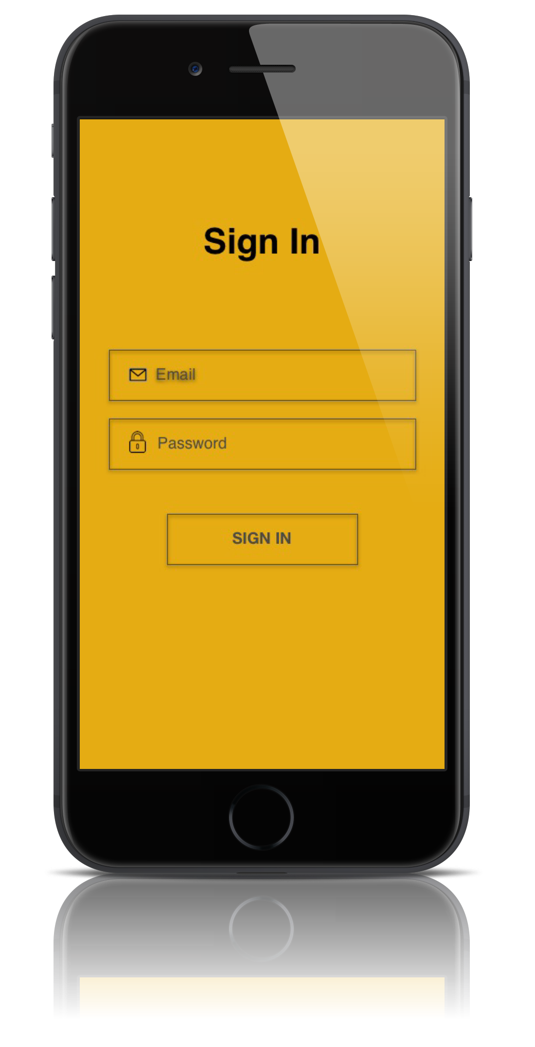
Delivery
Prototype Pitch
The final prototype was pitched in the form of a presentation to a group of fellow designers. We received feedback on our concept and were able to pull ideas for future iterations and versions. I learned that research is the key to informing the future success of a design.
Next steps:
- Rework the play button on the show screen
- Rework the viewing screen to simulate the true viewing experience
- Think about a better way to display the watch it now (clickable feature)