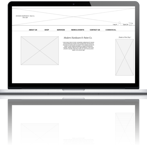



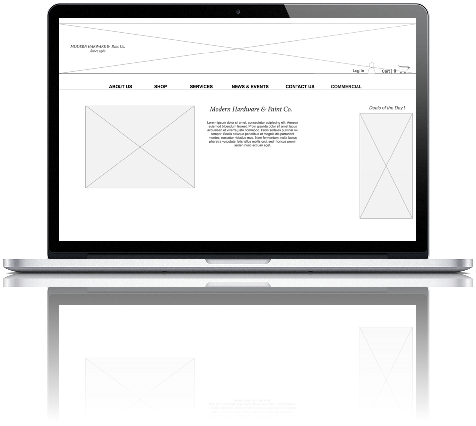
The goal of this concept was to add an e-commerce functionality to an existing website for a local hardware store that did not have online access to its products. It involved research to gain insight into what a customer would expect from an e-commerce site as well as understand the navigation, organization and purchase process.
My research indicated that most people prefer to shop local but need more access to the store and its products particularly when they can’t make it to the store.
New Features:
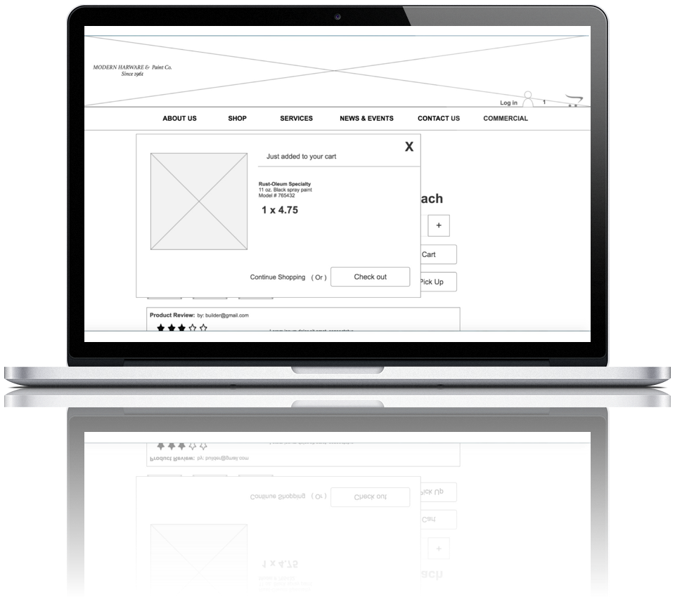
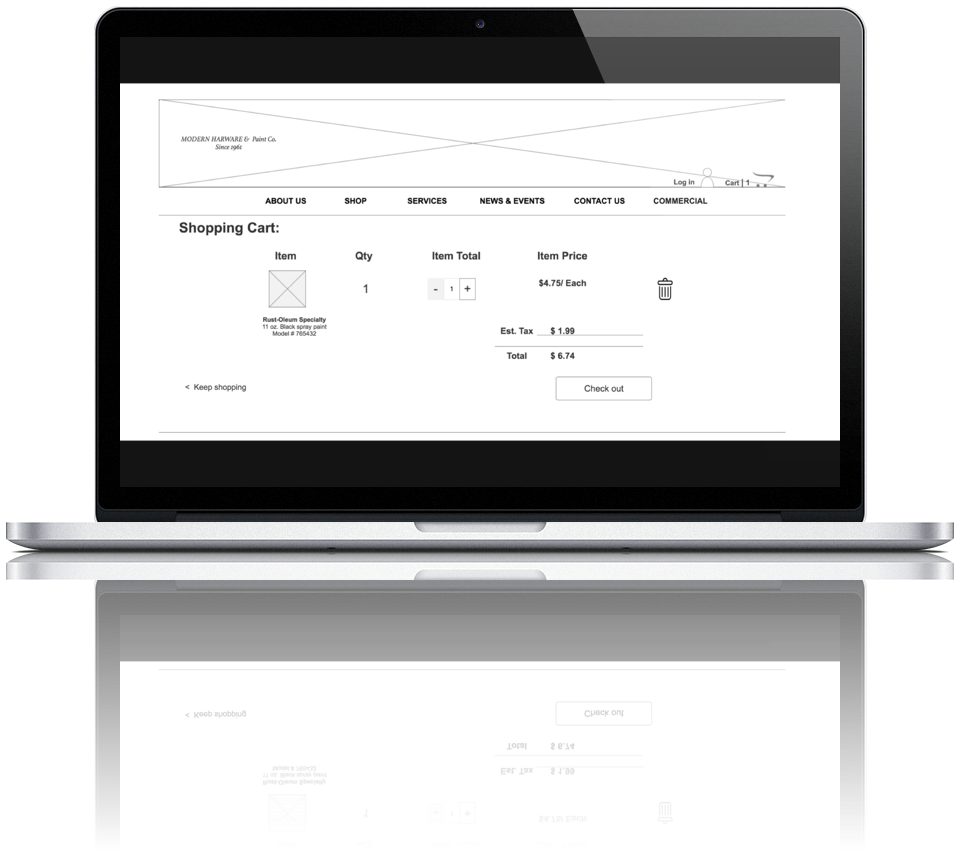
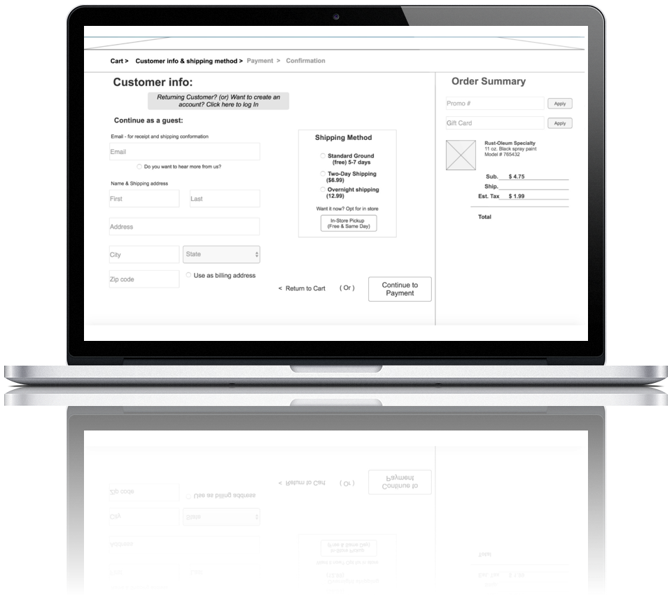
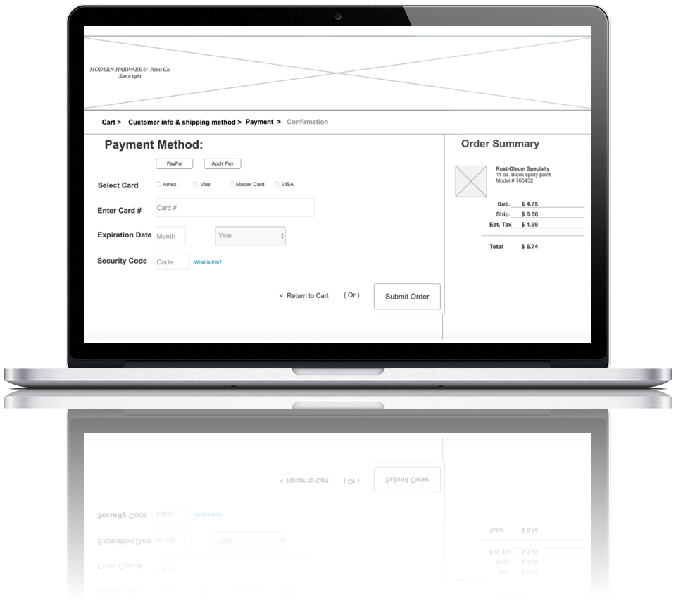
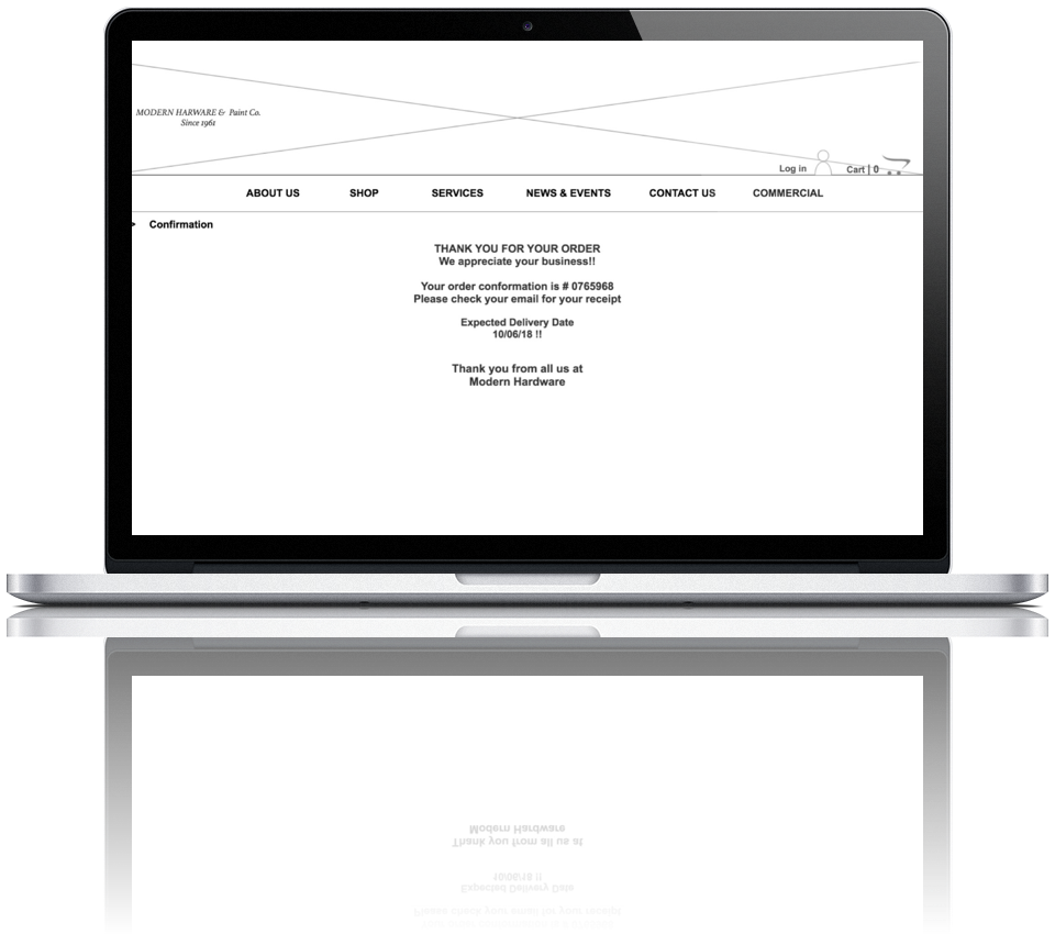
- Shopping cart feature and check out process
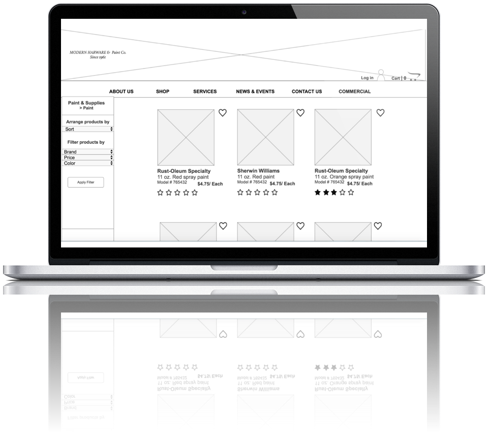
- Favorites flag and save commonly purchased items
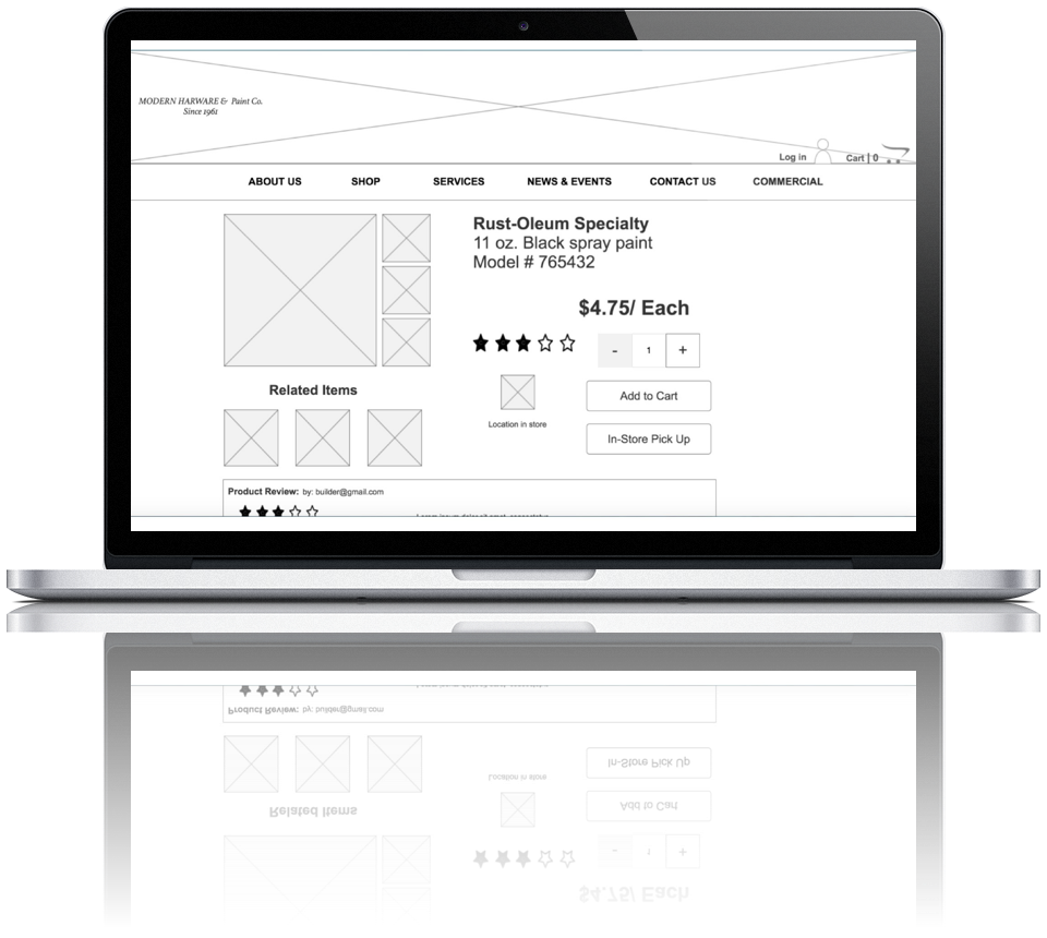
- In-store pick-up and delivery options
Perspective Client: Modern Hardware & Paint Co.
My Role: I was the sole designer for the research and design of this concept
Tools: Axure
Timeline: 2 Weeks
Problem Statement
Customers of Modern Hardware and Paint co. need a way to access the businesses inventory so they can be better prepared before coming into the store by knowing the product will be available before they arrive. Customers also need the choice to buy online with the option for delivery or in store pick up particularly those who are not proximal to the business.
Proposed Solution Statement
I believe that by creating an online e-commerce site for Modern Hardware Paint & co it will provide better access to the store’s products, customers will have the ability to view the inventory online before coming into the store and the convenience to make online and in sore pick up purchases, which will particularly benefit those customers who do not live proximal to the store
The Process

User Research

Development

Analysis

Testing

Design

Delivery
Research
User Research
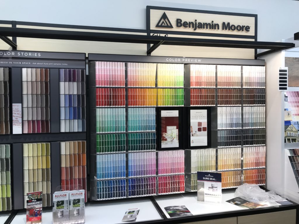
To begin the research process, I visited the hardware store, took pictures of the inventory and got a chance to speak with the owner about his customer base, popular products, its sales and history.
Visiting the store gave me a sense of the types products they carry as well as the focus for sales which was mostly paint products, basic tools and parts.
Surveys & Interviews
To identify my target user, I sent out screening surveys and set up interviews. I conducted a total of five interviews. The interviews were a way for me to determine shopping habits and understand when a user decides to shop online vs. in-store for hardware products. I also needed to determine what was expected from an online retail experience and why customers preferred to shop local versus at a big box retailer.
- People prefer to shop locally because they value the customer service, but find many stores are not accessible
- Shop mostly for DIY projects
- Convenience, accessibility, efficiency and planning options are important
- Like to view product information, reviews, price comparisons and availability online
- The decision to buy online really depends on when they need the product and how easily they can get it
“I shop local when I can but it’s often not convenient or accessible.”
“I like to shop local because I value the personal customer service.”
“I like to order what I want and have it shipped to me.”
Analysis
Competitive Analysis
Looking at other e-commerce hardware sites like Home Depot, Lowes and True Value gave me a sense of common ecommerce design practices, service standards, features and product organization.
- Sites were bulky with lots of sub categories
- Took time to navigate product pages
- The checkout process was tedious and in cases impossible
- Lots of clutter and banners
- Features: Option for in-store pickup or delivery and product favorites
Card Sorting
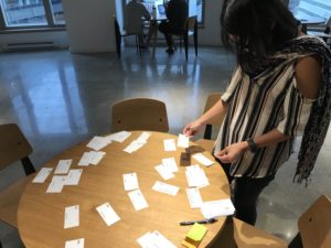
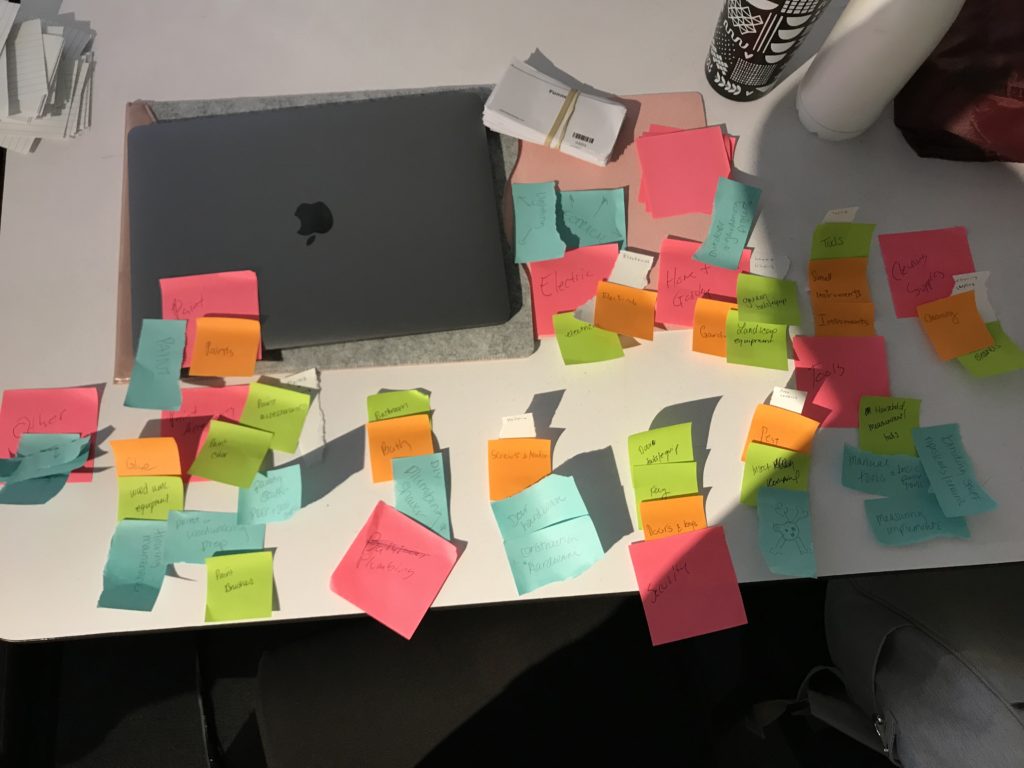
Determining organization of the products categories was achieved through four different open card sorts and one closed sort. Items like paint and cleaning supplies were sorted easily but some tools and hardware items had cross categories.
Affinity Mapping
Affinity Mapping solved questionable categories and set the ground work for a closed sort which confirmed the categories.
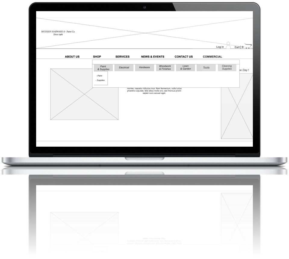
Paint & Supplies | Electrical | Hardware | Woodwork & Finishes | Tools | Law & Garden
Design
Navigation
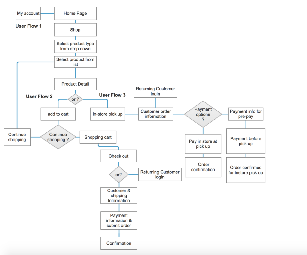
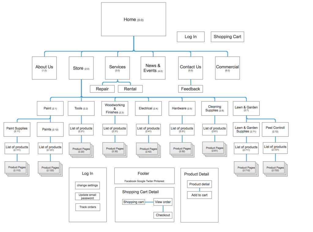
The site map mapped out the original site and incorporated store feature as a store tab. A user flow was made to address how a user might navigate through the online store, locate a product and go through the checkout process. This flow also incorporates how a user might opt for in store pickup.
Sketching
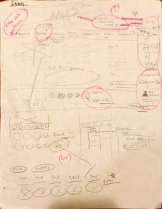
My research told me that I needed to keep the design clean, minimal and simple while still maintaining the integrity of the original site. I also needed to give customers a product search, information and different purchasing options
Main Page
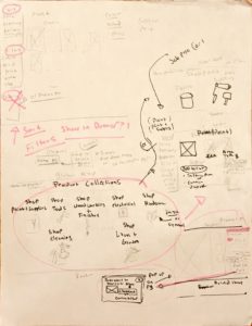
Navigation
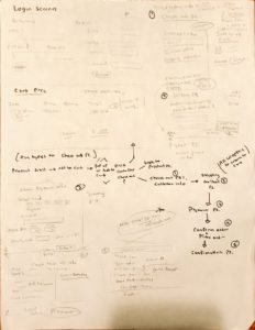
User Flow
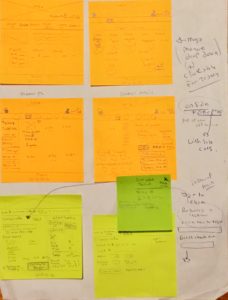
Template for prototype
Testing
Paper Prototyping
To determine the usability of my design I started with a paper prototype made from my sketches. I really needed to determine if a mega menu was necessary before getting into wireframing. I also wanted to confirm that the current user flow checkout processes were working. I conducted a total of 3 test and found that users preferred the mega menu and that the current flow worked.
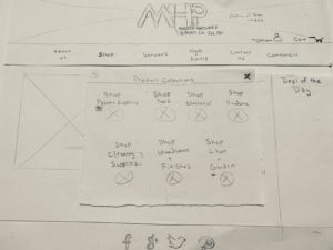
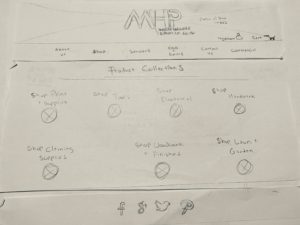
Mega Menu vs. Full Screen Menu
User Testing & Iterations
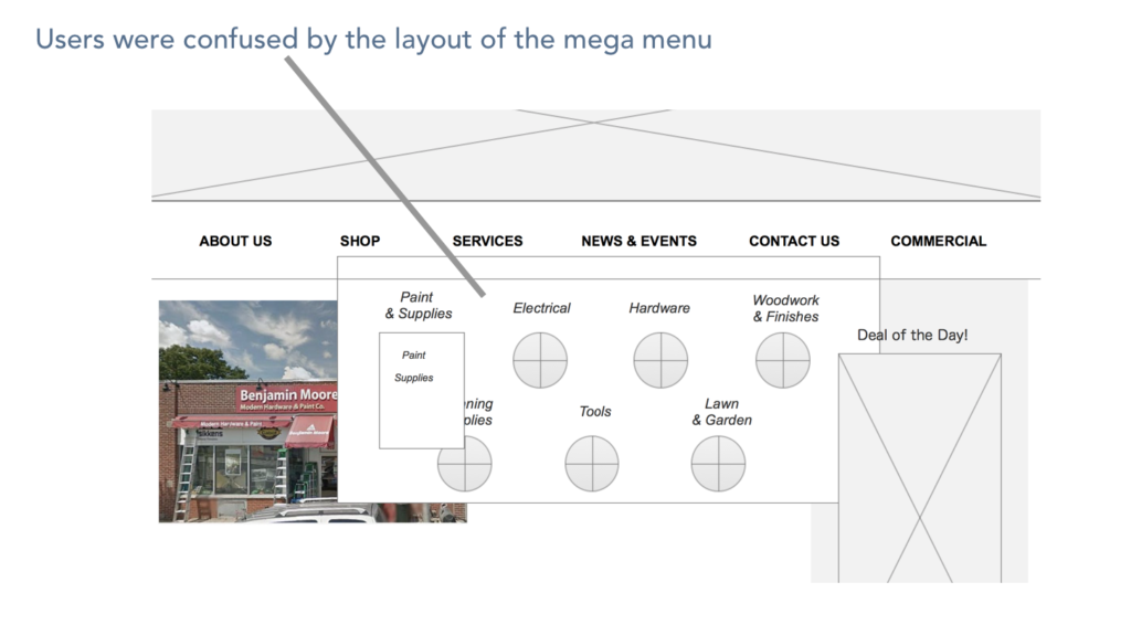
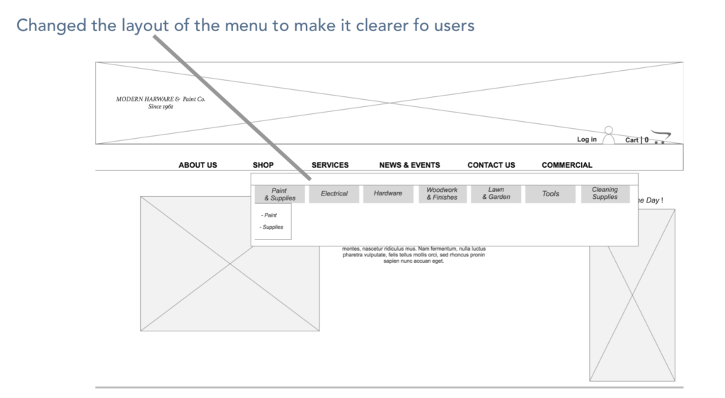
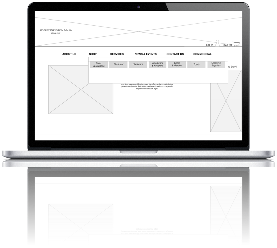
I translated the paper prototype to a wireframe and clickable prototype using Axure. From there I conducted a total of six usability tests. Users found that the current menu to be confusing and lots of little changes needed to made in the checkout process.
Delivery
Prototype Pitch
After making several rounds of iterations I had the opportunity to pitch the prototype concept in front of a group of designers. I learned that creating a simple design with seamless navigation and checkout processes can lead to an excellent customer experience. Also, that presenting product information, simple layouts and sorting options for users creates simplified access to the products.
Next Steps:
- Consider more product filter options
- Build out the in-store pickup feature
- Build out the customer login and favorites feature